Your menu isn't a catalog; it's a sensory roadmap that guides a guest toward the decision you want them to make. Most operators treat menu design like an art project, but the reality is that high-margin dining is built on hardwired human biology.
Key Takeaways
The brain scans menus in a "Z-pattern," making the top right corner your most valuable real estate.
Removing dollar signs reduces the "pain of paying" response in the prefrontal cortex.
Strategic "anchoring" uses high-priced items to make mid-range margins look like a bargain.
Choice overload triggers decision paralysis, causing guests to default to the cheapest option.
The Cognitive Map: Where the Eyes Go First
In a frantic dining room, the human brain seeks the path of least resistance. Neuroscience tells us about "Scanpaths"—the subconscious way eyes move across a page. For a traditional two-panel menu, the gaze starts in the center, jumps to the top right, then sweeps across to the top left.
If your highest-margin item isn't sitting in that top-right "sweet spot," you are burning money every time a guest opens the folder. This isn't about your favorite dish; it's about the dish that keeps the lights on. Position it where the brain naturally lands before fatigue sets in.
The Pain of Paying and the "Dollar Sign" Trigger
Neuroimaging shows that seeing a currency symbol activates the same part of the brain as physical pain—the insula. When you put a "$" next to a number, you are literally poking the guest's biological defense mechanism. It reminds them they are losing resources.
Remove the dollar signs. Use simple numerals. By softening the "pain of paying," you shift the guest's focus from the cost to the perceived value of the experience. It’s a subtle shift in the prefrontal cortex that leads to a higher check average without changing a single recipe.
Price Anchoring: The Ego and the "Decoy"
Human beings are terrible at determining absolute value, but we are experts at comparison. This is the "Anchor Effect." If you place a $145 Tomahawk ribeye at the top of the steak list, the $52 Filet suddenly feels like a sensible, even frugal, choice.
"The expensive item exists not to be sold, but to make everything else look like a steal."
This appeals to the guest's ego. They don't want to be the "cheap" person ordering the lowest-priced item, but they aren't ready for the splurge. By providing an anchor, you give them permission to spend more than they planned while feeling like they made a smart financial move.
The Paradox of Choice: Less Is More Profit
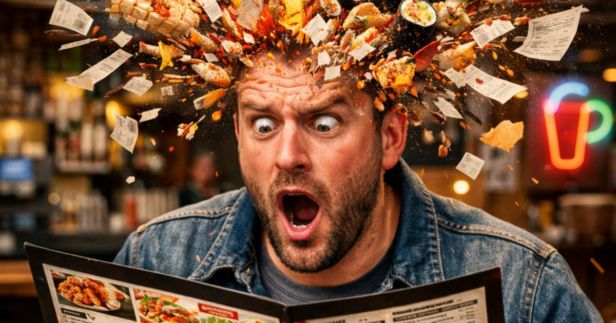
Operators often think a 50-item menu shows "variety." Neuroscience says it shows "stress." When the brain is presented with too many options, it experiences "choice overload." This leads to decision fatigue, where the guest picks the most familiar (and often lowest margin) item just to end the mental labor.
Limit your categories to five or seven items. This keeps the guest in a state of "flow" rather than analysis. A streamlined menu ensures the brain can process information quickly, leading to faster table turns and higher satisfaction.
Frequently Asked Questions
Does the font really matter for sales?
Absolutely. Simple, clean fonts are processed faster (Fluency Effect), which the brain associates with a "comfortable" choice. Overly complex fonts can make a dish seem more difficult or expensive to justify, though they can work for premium "reserve" items to signal rarity.
Should I put my prices in a vertical column?
Never. Aligning prices in a column allows the guest to "price shop" by scanning down the right side of the menu. This turns your food into a commodity. Nest the price at the end of the dish description in the same font so the eye has to read the value before seeing the cost.
Take Control of the Guest Journey
Stop treating your menu like a list of ingredients and start treating it like a psychological tool. When you understand how the brain processes data, you stop guessing and start engineering. This is the difference between a passion project and a profitable powerhouse.
Ready to stop leaving your margins to chance? At MiseUp, we help operators bridge the gap between "good food" and a "good business" by fixing the hidden friction points in your operation. Let’s get to work.